Mobile app design
CASE STUDY
TalentCards mobile app is the most modern approach to training people.
It was created by the company (Epignosis) that has already developed two successful LMS platforms, eFront and TalentLMS, which have gone to win multiple industry awards, and to be used and loved by thousands of satisfied customers, from small and medium businesses to large multinationals.
I have designed the mobile application and then I designed the website supporting the mobile app.

We have worked together with Petros to build talentcards.com, talentlms.com, efrontlearning.com and snappico.com. I can only say that he has been a pleasure to work with!
Generally, if you are looking for an exceptional visual designer you ought to consider him for your next project.
Thanos Papangelis Founder of eFront and TalentLMS
Project scope
Intuitive, user friendly,
learning on the go
My role in this project was to deliver wireframes and hi-fidelity mockups of a mobile application that had to do with training people on a mobile app for both platforms iOS and Android.
As always, I did my research, first on learning mobile apps around both stores, and then I started designing the lo-fi wireframes for discussion with the client.
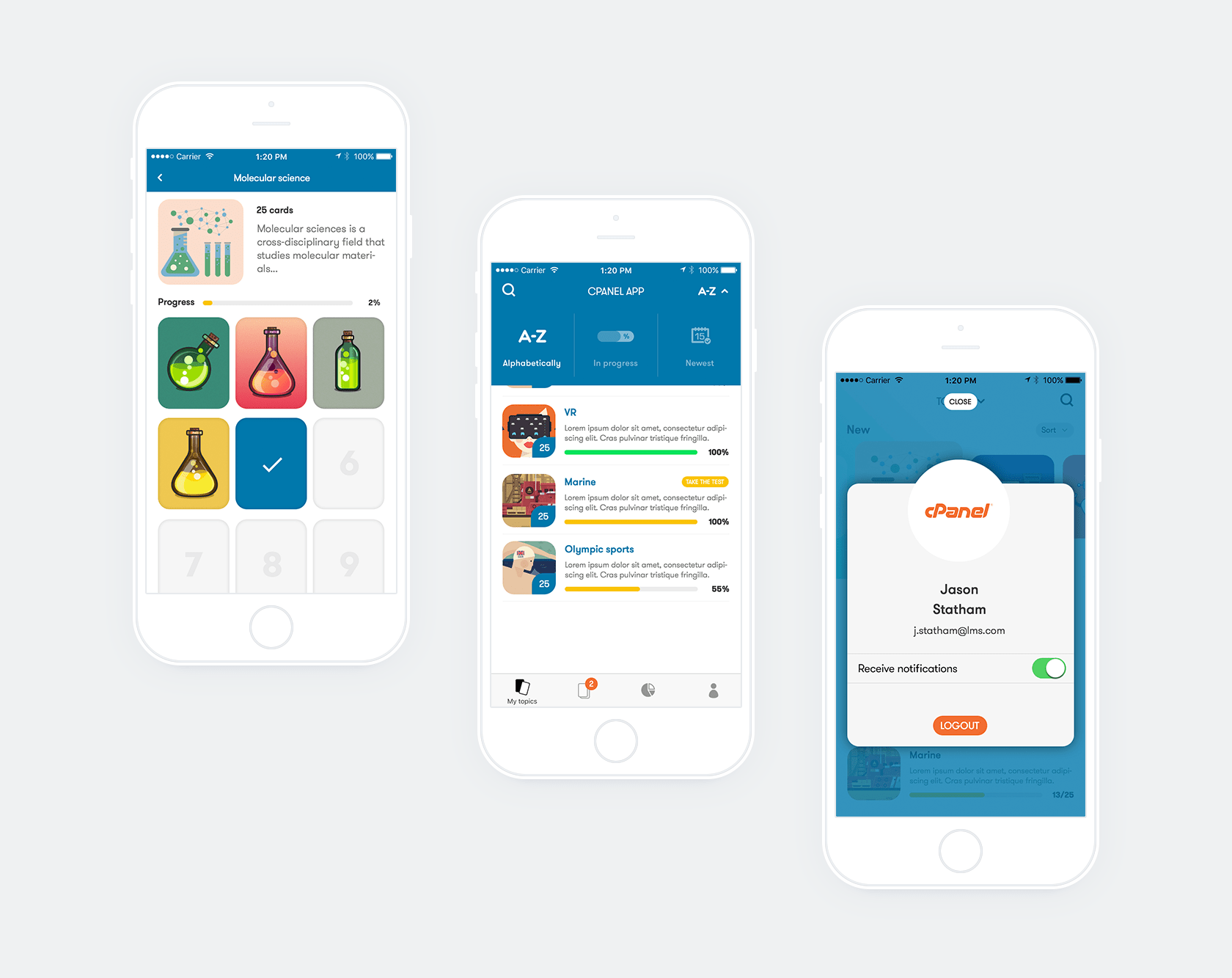
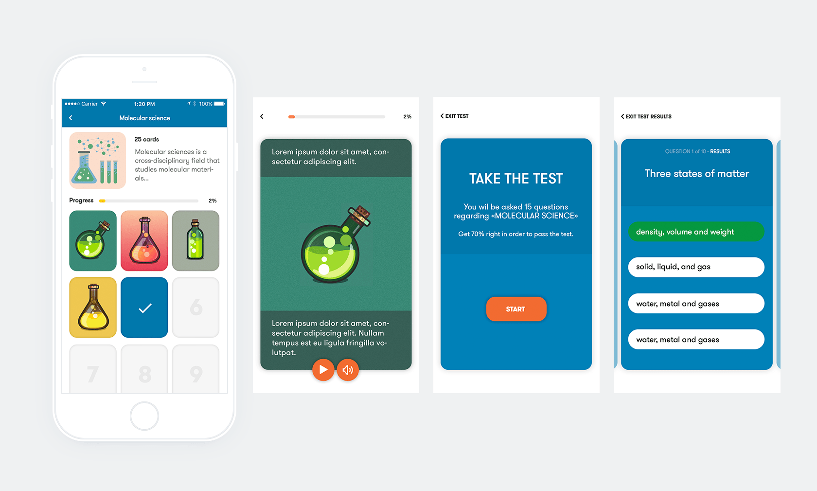
The scope was to design a simple interface with no clutter and use cards as the main graphic element for presenting the information. Cards resemble physical cards. Cards are an excellent UI element but not only for the look. Both sides can be used for presenting information.
The client is a leader in LMS software so they have the know how and expect an intuitive app rich in UI graphics and friendly UX for the user.
Cards were just the tip of the iceberg. I had to design UI elements for features like tests, gamification elements like leaderboards for higher engagement and rich cards combined with multimedia extensions.
Website design
A nice wrap for a perfect project
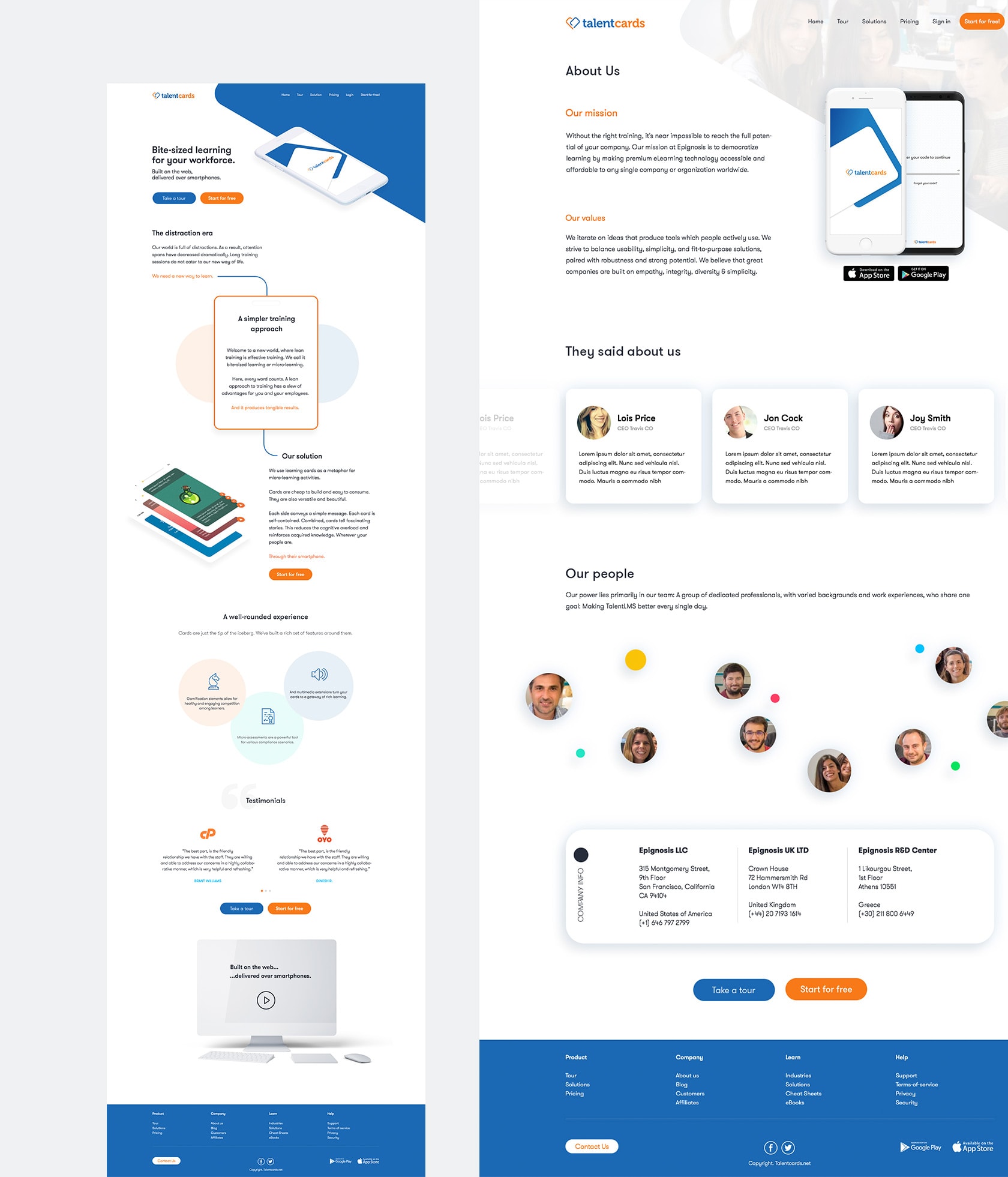
Since I designed the whole app I had the pleasure to design the website too.
My goal was to design a website visually compelling and make clear to the user what he can find and send him to the CTA button. Graphic elements were used from the app along with illustrations to help guide the user and make the entire experience a more enjoyable one.
The feedback was great from the first users. Some mention "It is very user-friendly and intuitive. We love the design, visual elements and how easy it is to create training cards. No one has enough time to do training anymore. They would rather study on the go, while working or riding the bus.”
Making happy clients mission, accomplished ;)